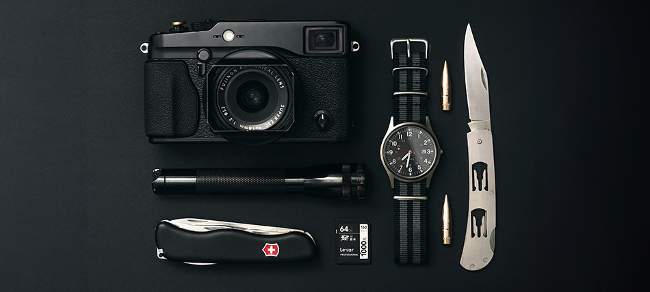
A University of Minnesota study found that 35-45% of participants perceived websites with white space as more trustworthy and credible. In the intricate world of design, there exists a powerful yet often underestimated tool that holds the key to user engagement and experience – white space also known as negative space. This refers to the space within and around other design elements, forming a backdrop that binds the elements together, allowing them to stand out.
Let’s delve into why designing white space is crucial and explore the two main types: micro and macro white space.
Micro white space refers to the small spaces between design elements, such as lines, paragraphs, and images. It directly influences content legibility, affecting the user’s reading speed and comprehension. For instance, adequate micro white space around paragraphs enhances the readability of text, ensuring a smoother user experience.

On the other hand, macro white space encompasses the larger spaces between major layout elements and surrounding the design layout. It acts as a container for the overall design, contributing to the webpage’s aesthetics.
Notably, macro white space is exemplified in websites like Google.com, where its simplicity and lack of clutter create a calming effect, allowing users to focus on their primary goal.
Let us look into real-world examples of companies that have used negative space and made it unique

The choice between micro and macro white space depends on several factors:
- Content: The amount of information in the layout influences the balance between micro and macro white space. More information may reduce macro white space but increase micro white space to maintain readability.
- Design: The chosen design style and user interface design influence the ratio between micro and macro white spaces. Designers make decisions that may bias the layout towards one type of white space over the other.
- User: Understanding the target audience, including demographic information, helps determine the right balance of white spaces for a specific user group. User research is crucial for tailoring the design according to audience preferences.
- Branding Message: White space can convey a company’s budget and the perceived quality of its products. Brands like Apple, Mercedes Benz, and IKEA strategically use white space to support their image.
Three Elements to Consider When Designing Negative Space:
- Legibility: Micro white space is critical for ensuring the legibility of interface content. Designers must consider white space when determining typography specifications, impacting elements like font, size, color, and spacing.
- Design Tone: White space contributes to the overall tone of the design. Websites with more macro white space may convey minimalism and luxury, while those with less may appear informative, as seen in news websites.
- Focus and Attention: White space can guide users through interactive content by building focal points and directing attention. It plays a strategic role in prioritizing specific elements or content within the design.
Here are a few tips for using space effectively in your designs:
- Start with a clean slate: Begin by removing any unnecessary elements from your design. This will give you more negative space to work with.
- Consider the purpose of your design: What do you want your design to communicate? Use negative space to emphasize the vital elements and guide the viewer’s eye.
- Experiment with different layouts: Try different arrangements of your positive elements to see how they interact with the negative space.
- Not a wasted space: Negative space cannot be wasted space. It is an essential element that can make your design more effective.
White space, or negative space, serves as the area between design elements, offering designers a powerful tool for enhancing the user experience. Contrary to its name, white space can be of any color, texture, or pattern. Designers can strategically introduce white space based on content volume, design style, user preferences, and brand image. By understanding the dynamics of micro and macro white space, designers can create layouts that look aesthetically pleasing but also facilitate a seamless and engaging user experience.


